 Ahmad
Ahmad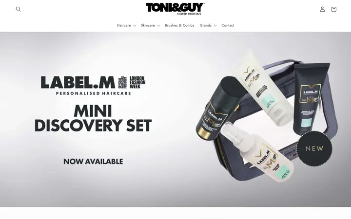
The customer journey
The shop gives visitors routes into haircare, skincare, brushes and combs, and individual brands. Its landing experience combines the TONI&GUY identity with featured products and collection navigation.
What the experience shows
- Recognisable presentation: the store keeps its regional brand identity visible while product photography does much of the selling.
- A path into the catalogue: product categories help customers narrow down the next step.
- Commerce-led navigation: search, account and cart controls give returning shoppers familiar tools.
How to assess an ecommerce project
For a store like this, a useful review follows the whole shopping task: find a product, understand it, choose the correct option, add it to the cart and complete checkout. Mobile product discovery and clear delivery information deserve as much attention as the homepage.
Those are the evaluation priorities for an ecommerce engagement. This portfolio record does not include conversion-rate or revenue data, so no sales uplift is claimed.
What a similar engagement can cover
Store architecture, theme design, product and collection templates, content setup, agreed integrations, responsive QA and a plan for measurement after launch. Migration, subscriptions or custom functionality should be scoped separately against the business requirements.
Listed in the O Trucking portfolio. The live storefront and screenshot establish the visible experience and regional brand scope. Exact contribution, delivery dates and commercial results are not recorded in the supplied project evidence.
Visit the website ↗ · Portfolio source ↗
Can you help with a similar project?
Yes. Start with the business goal, the audience and what visitors need to do. We can map the design, development, content and integrations around that task.
Does this example guarantee the same outcome?
No. The scope, starting point and business conditions differ. Define the goals and how to measure them before the work begins.