 Ahmad
Ahmad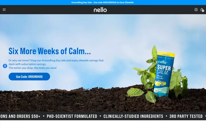
The first impression
A large campaign hero gives the homepage an immediate focus. Bright blue, contrasting product colours and expressive photography carry the brand into the sections below.
From campaign to catalogue
The homepage moves from the featured campaign into brand principles and the Superpowders range. Product cards bring photography, flavours, subscription choices and shopping actions together, reducing the distance between discovery and a product decision.
What this design demonstrates
Consistent colour connects the page, while the product photography helps distinguish the range. A useful review of a similar store would follow the full mobile shopping journey, including product information, recurring purchase terms and checkout.
Listed in the O Trucking portfolio. Design observations are based on the public homepage captured on 13 October 2026. Exact contribution, delivery dates and commercial uplift are not established by this record.
Visit the website ↗ · Portfolio source ↗
Can you help with a similar project?
Yes. Start with the business goal, the audience and what visitors need to do. We can map the design, development, content and integrations around that task.
Does this example guarantee the same outcome?
No. The scope, starting point and business conditions differ. Define the goals and how to measure them before the work begins.